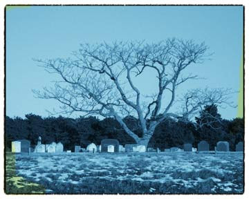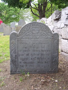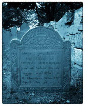
Old-fashioned cyanotypes vary quite a bit in color from print to print. When you want to create one digitally, a good way to chose the color is to scan a real cyanotype and sample the color from it!
If you don’t have a sample of a real cyanotype blue to use, here’s a fairly decent way to find one. You’ll need to play around with the sliders until the color looks good to you…there was quite a bit of variation in the color, so don’t feel that it has to match one you’ve seen exactly.

1. Open your image in Photoshop and duplicate it.
2. Open the channel mixer, tick the Monochrome box, and play with the sliders. I like to have blue up around 80 or 90, red from 10 to 20 to add noise, and green at 0. Lower the contrast too.
3. Open up a curves adjustment layer, clipped to the previous layer. Pull the line up somewhat for blue and down somewhat for red. Mess around with the settings until you like the overall color and contrast.
4. Select an oval around your main subject. Select the inverse and feather it. Use the levels adjustment to darken the edges of the photo.
5. Enlarge the canvas by adding a thin border of white all around the image.
6. Add a new layer and create a border using a dry brush with black. Move this layer underneath the background copy layer when it’s finished.
7. Add stains. Add a new layer to the top and paint on yellowed stains using the Color Blending mode.

Copyright 2008 Cyndi Lavin. Not to be reprinted, resold, or redistributed for profit. May be printed out for personal use or distributed electronically provided that entire file, including this notice, remains intact.
Technorati Tags:mixed media,collage,assemblage,digital art,photography,altered books,art journals

Comments
I love the effect and I would like to know how to achieve it.
thanks
Phil
First I added the extra space all around the image by using the enlarge canvas command on a separate layer from the image. Then, on another separate layer, I used a dry brush with black paint and painted all around the very outside of the image, overlapping the edges slightly. When this layer is moved in between the canvas and the image, it appears as a ragged black border similar to the ones you see on old photos. I don't supposed it really matters which order you do this in...it's just the way I did it and wrote it down. There's usually multiple ways to get the same look with PS, which is both wonderful and frustrating!